
Hey All,
This post will be quick since life has been pretty busy. This will not be a post or a graphic that blows your mind, but I’m still building up the scripts to do the analysis in R. Once I have built up some code repositories the analysis turns will go quicker, and we will be able to dig up more interesting details. That being said, I wanted to go ahead and begin posting these quick graphics as we create them.
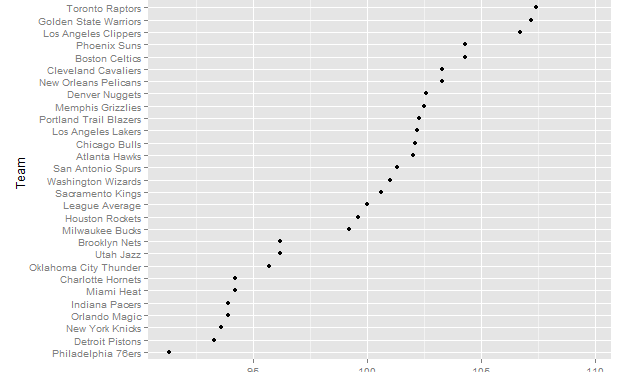
This simple graphic shows every teams’ points per game through Dec 17. We see the Mavericks separating themselves as the team scoring the most points per game on average, while the 76ers bring up a pretty pathetic rear.
The difference between teams is pretty continuous; however, we see a clear break in PTS/G right after the Milwaukee bucks. While there is more to a team’s quality than PTS/G, the teams falling below this split are lottery teams (or Eastern Conference Playoff teams 6-8 – which isn’t much better).
Leave a Reply